Most companies are unfortunately lagging behind when it comes to keeping pace with the rapidly-growing mobile market. The result is a disastrous user experience and major losses in potential customers who leave in search of more mobile-friendly sites. So that being the case, how can companies adapt to these new users and what strategy should they use?

Why a mobile strategy?
More and more people nowadays access the Internet from their mobile phones. In Belgium, around one in three people have a smartphone and 40% of them access the Internet on it on a daily basis (source: IAB)
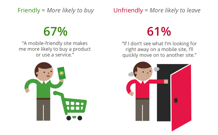
Tariffs are increasingly competitive, the devices available are getting cheaper and more sophisticated… and so the mobile phone has a promising future ahead of it! A number of forecasters are predicting that in 2013, more people will access the Internet from a mobile device than from a PC. And yet, 60% of the 100 top brand websites in Belgium are not adapted for use with mobile phones. And 61% of mobile Internet users admit that they look elsewhere if they cannot find the information they are looking for immediately, meaning a significant loss in traffic… and therefore in potential clients!
 Source: Google
If you want to find out what the percentage of mobile traffic to your site is, have a look at your Google Analytics data. That way, you’ll know what you’re missing out on and whether or not it might be a good idea to look into a dedicated strategy for this particular user category.
Mobile site, application or Responsive Design?
Mobile site
A mobile site is separate from the standard site. It has been specially designed to adapt to mobile phone screens. This means that the whole site has to be completely overhauled in order to highlight essential and useful information for rapid browsing.

When might it be more sensible to develop a mobile site?
Developing a mobile site has benefits if most of your visitors browse your site from a mobile. It will ensure that all of your visitors are able to browse in optimum comfort and will maximise your audience.
Unlike an application, a mobile site can be read by all devices – irrespective of the operating system they are running. They are also less costly to develop.
Disadvantages:
- A mobile site is a simplified version of the standard website. It does not have all of the features or content, and this can sometimes be a source of frustration for users.
- Accessing a mobile site takes longer for users. Accessing an application involves simply pressing on an icon (once it has been installed), whereas accessing a mobile site involves entering a URL into a browser.
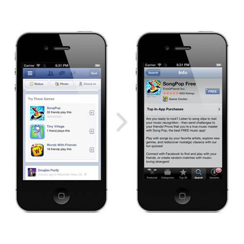
Application
An application is a programme that has to be downloaded and then installed on the user’s smartphone via a download platform (Google Play Store, App Store or BlackBerry World).
When might it be more sensible to develop an application?
Developing an application is particularly useful if you want to insert animations and get the user involved. An application’s user experience is generally enhanced by the speed and ergonomic design of the interface (it will have been specially designed for mobiles).
Applications can also be used to further develop user loyalty. They can access it whenever they like and don’t need an Internet connection. They can also receive push notifications (automatic alerts).
Disadvantages:
- An application has to be specially developed for each download platform.
- An application has to be approved and is subject to the platform’s rules. And these rules are not fixed – they can sometimes change during an application’s lifetime. This may mean you have to redesign the application in order to ensure that it remains on the platform.
- SEO for an application is not possible. You can only have your application displayed on the results page by paying.
- Development is complicated and costly.
- An application is designed to meet a user’s specific requirement. Its lifetime is therefore shorter.
Note: designing a mobile site doesn’t mean you can’t have an application. If you want to meet different requirements, both strategies can be implemented at the same time.
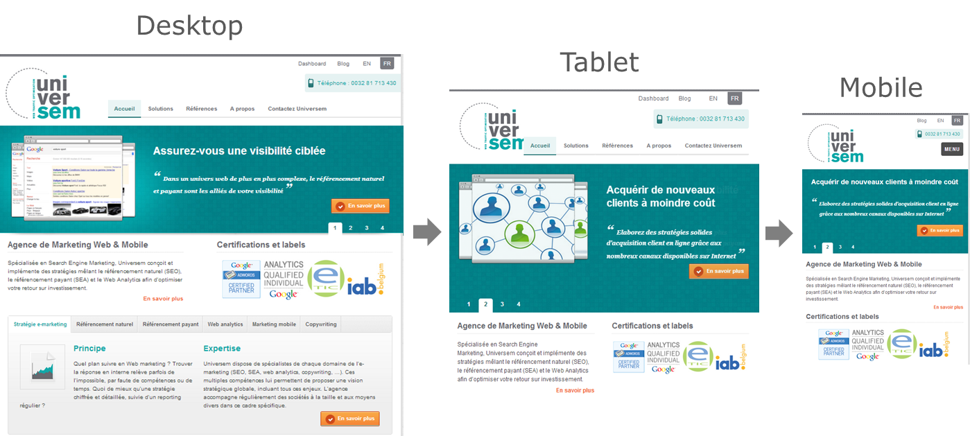
Responsive Design
With Responsive Design, your site automatically adapts to different screen sizes. To find out more, have a look at our article on Responsive Design.
When might it be more sensible to develop a Responsive Design site?
Responsive Design is a practical and economical alternative that will ensure that your site can be accessed by all mobile devices. Your site will be displayed differently depending on how users are accessing it, thus enhancing their experience of it. And you will only need one version of it – only the way in which information is arranged on it changes.
Disadvantages:
- Responsive Design involves strategically reorganising information (order, size, etc.) so that each user type is shown the most appropriate content.
- The user experience is usually less good than that of sites that have been specifically designed for mobile devices. Multiscreen display will not meet all of the user’s specific requirements.
- It usually takes longer for pages to load than on a mobile site or on a dedicated application.
Need advice for your mobile strategy or help promoting your site or application? Please feel free to contact us.
Did you enjoy this article? Then please share it!
